T-Pay: Payment System
T-Pay is a payment system for public transport allowing payments with mobile devices. Included are two mobile apps (one for passengers and another for conductors), two web apps (for passengers and for employees of the transport company) and a landing page.
IBA Group, Web & Mobile App, B2C, Prototyping, Research, Android, iOS
UX/UI Designer, Graphic Designer
Goals
The ticketing app aims to optimize ticket turnover for carriers while offering a simple, secure, and efficient way for users to purchase public transport tickets. By utilizing QR codes, the app streamlines the ticketing process, reducing wait times and queues, and enhancing the overall user experience for both carriers and passengers.
No such system existed on the market at that time
My work
Collaborated with stakeholders to define product MVPs, prioritize features, and manage design tasks.
Conducted UX research, including user interviews and usability testing, to guide design decisions.
Designed user flows, prototypes, UI components, animations, and promotional materials for:
Ticket Validation Devices: Developed interfaces to automate the ticket-checking process for transport companies, improving user experience with data-driven insights.
Telegram Payment Bot: Designed landing pages and bot interfaces with integrated payment functionality, optimized for seamless interactions.
Admin Desktop App: Created a user-friendly management tool, leveraging reusable components from the design system.
Logistics Management System: Developed UX/UI for a desktop app to manage routes, tickets, and statistics, enhancing operational efficiency.
Design Process for the Project
Step 1: Discovery
Defining the main ideas and technical challenges. At this stage, the first iteration of the technical documentation was created.
Step 2: UX Research
Focusing on research, creating an information architecture, interaction design and wireframes
Step 3: Prototyping & Testing
A/B testing for design solutions and usability testing for prototypes to make sure our product is good enough.
Step 4: Design
Designing the visual part based on the results of the previous steps.
Step 5: Back to step 2…
Improving the product based on customers feedback.
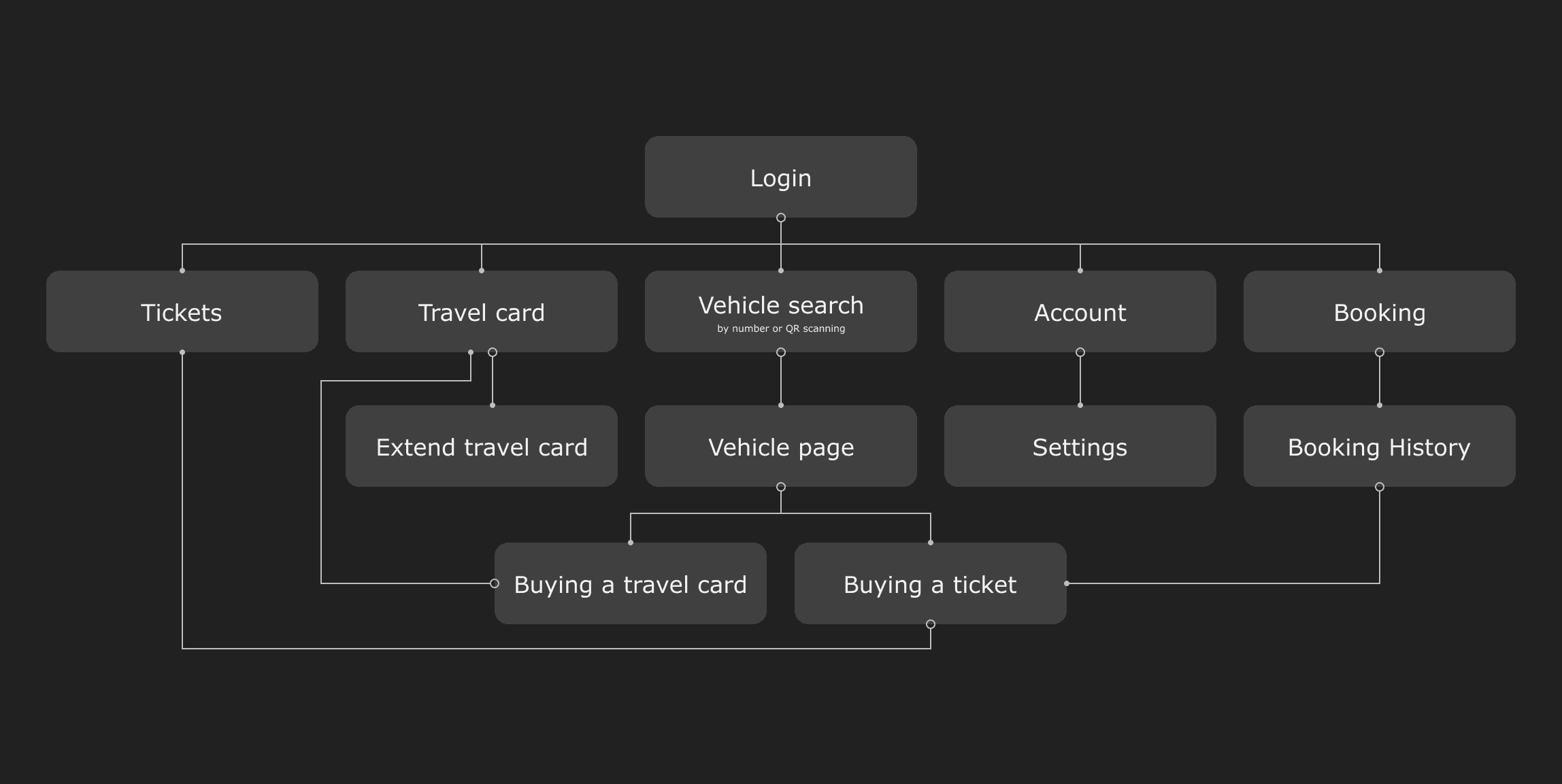
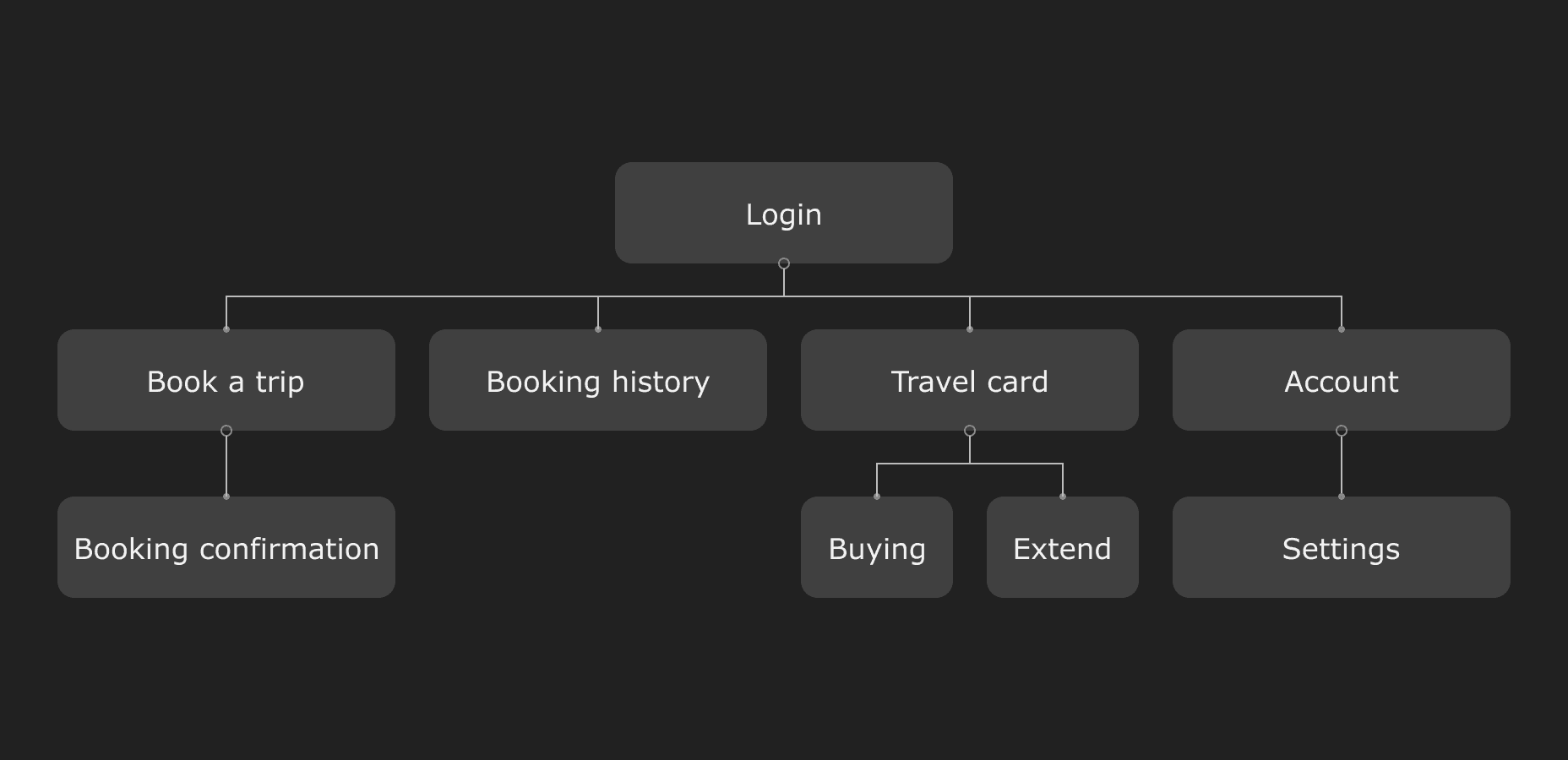
App Architecture
Mobile Application
Web Application
User Interface
I designed the UI in Figma and created graphic materials with Adobe Illustrator, Photoshop, and After Effects.
Sign Up / Login
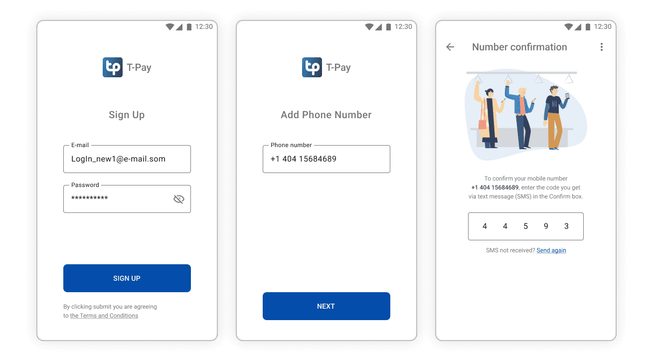
The user logs in via email and attaches a phone number for two-factor authentication, and the SMS code is automatically inputted.
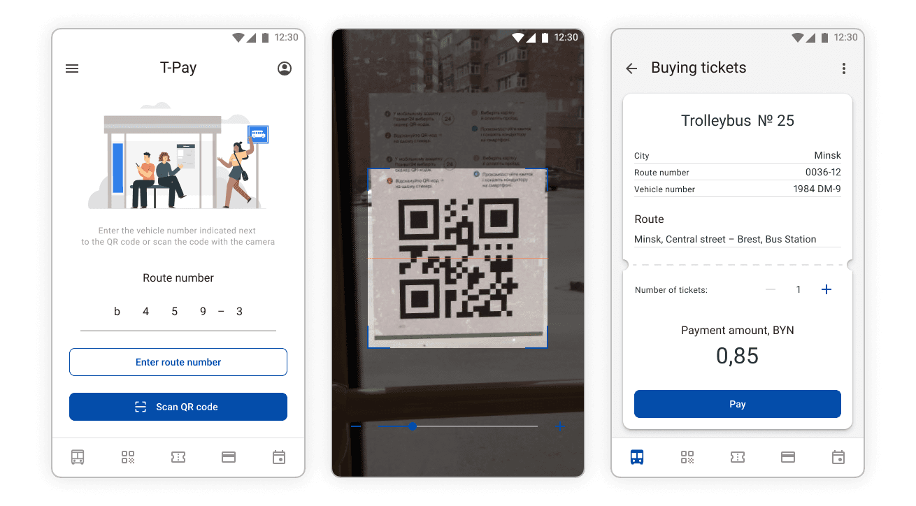
Vehicle search and Tickets
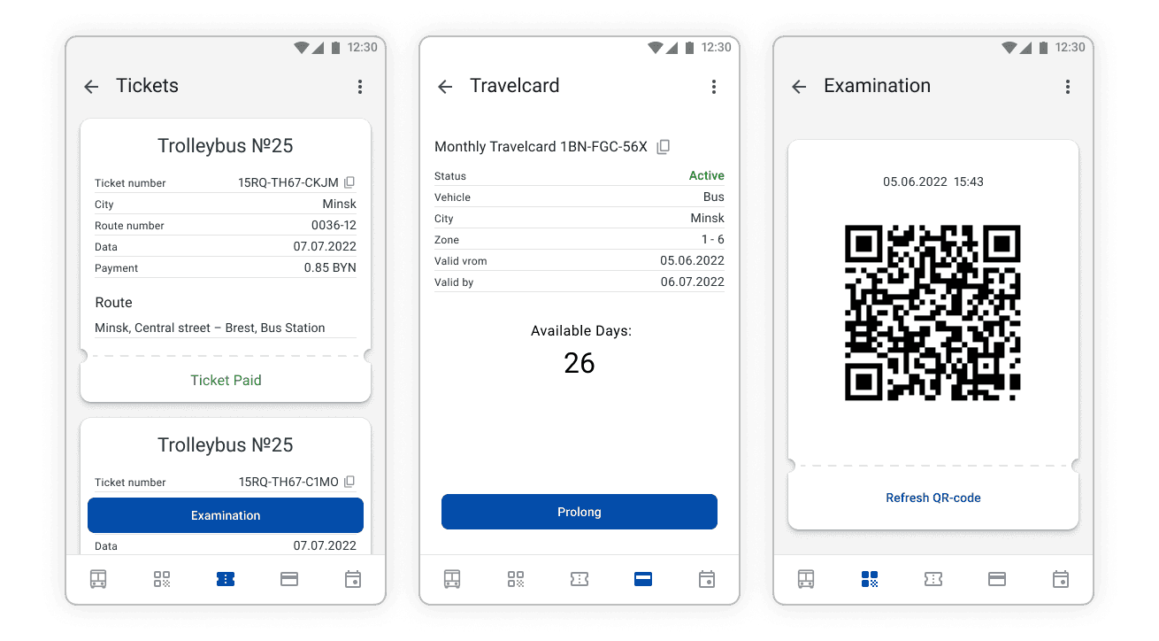
Users can purchase tickets by entering the vehicle number or scanning the QR code, then selecting the number of tickets needed. The "Pay" button generates a secure link to the user's banking app for payment. Once paid, the ticket status updates to "Ticket paid," and purchased tickets can be accessed on the "Tickets" page.
For added security, we don't collect any personal information beyond email and phone numbers. Our system works the same way for travel cards, which can also be purchased using the app.
Supervisors can verify payment status by scanning the QR code on the examination page.
Book a trip
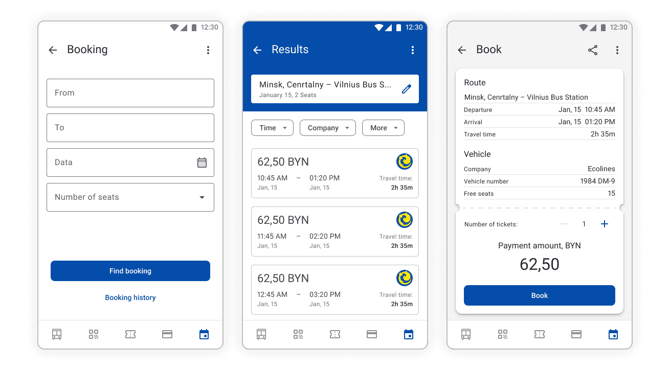
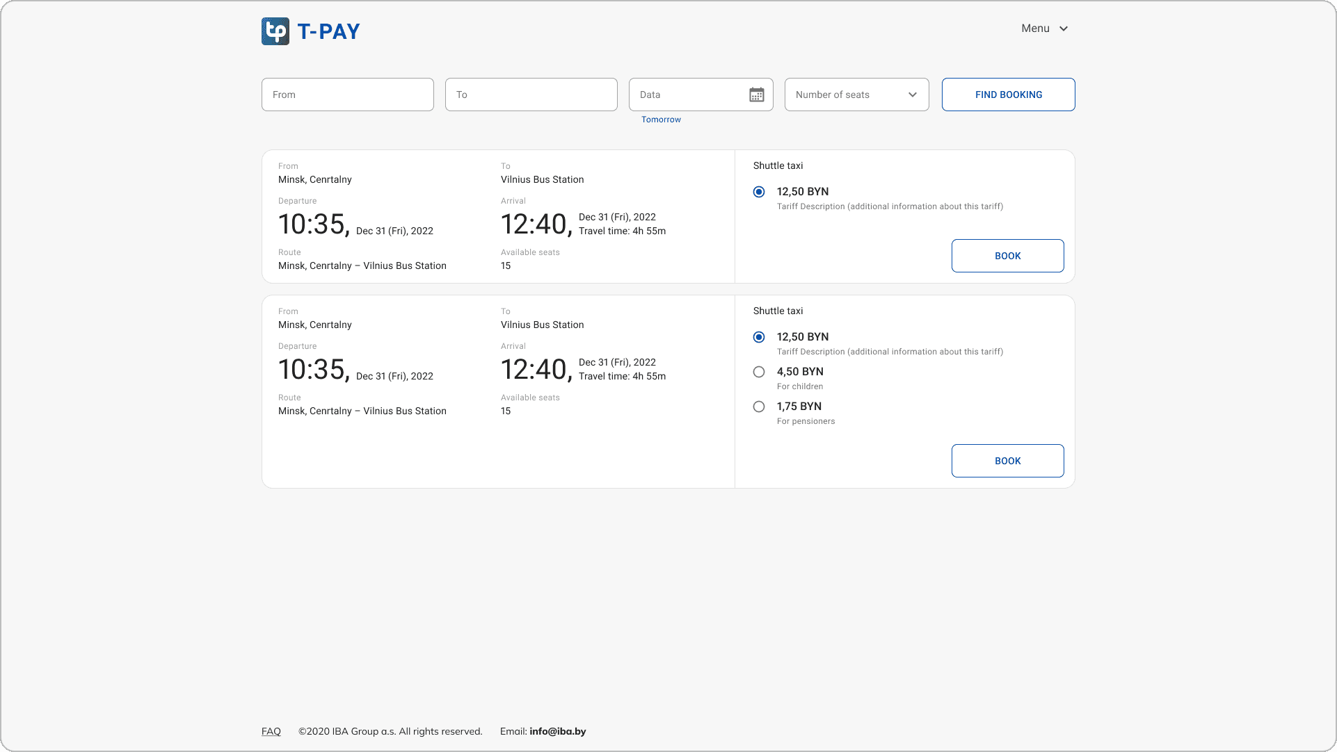
Users select their starting point and destination from a drop-down list, then enter the travel date and ticket quantity. The app shows available trips with key details, such as departure time, arrival time, and price. A simple filter bar allows users to refine the results based on preferences.
Desktop App
Book a trip
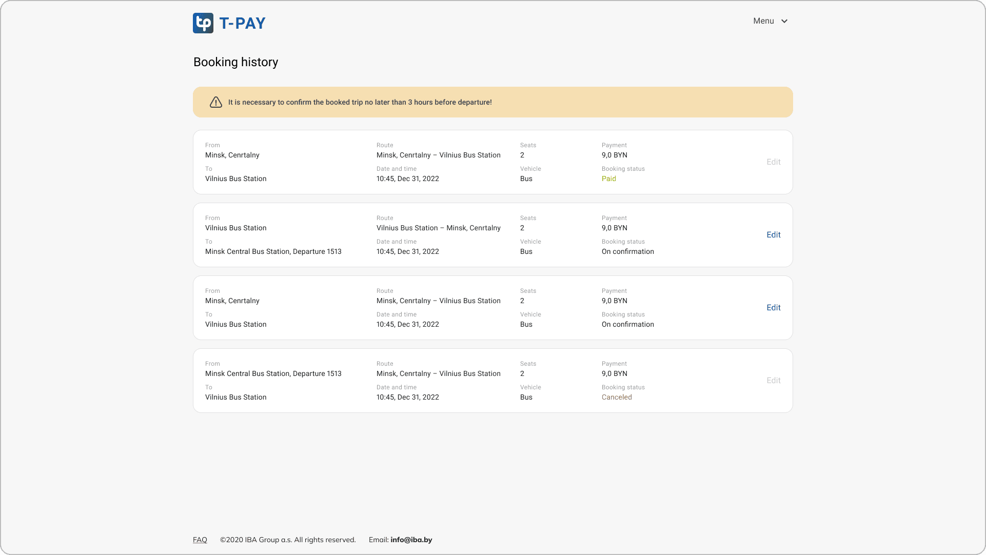
The desktop application offers booking features similar to those of the mobile application.
The Booking page contains all the information available on both the mobile and desktop applications.
Landing Page
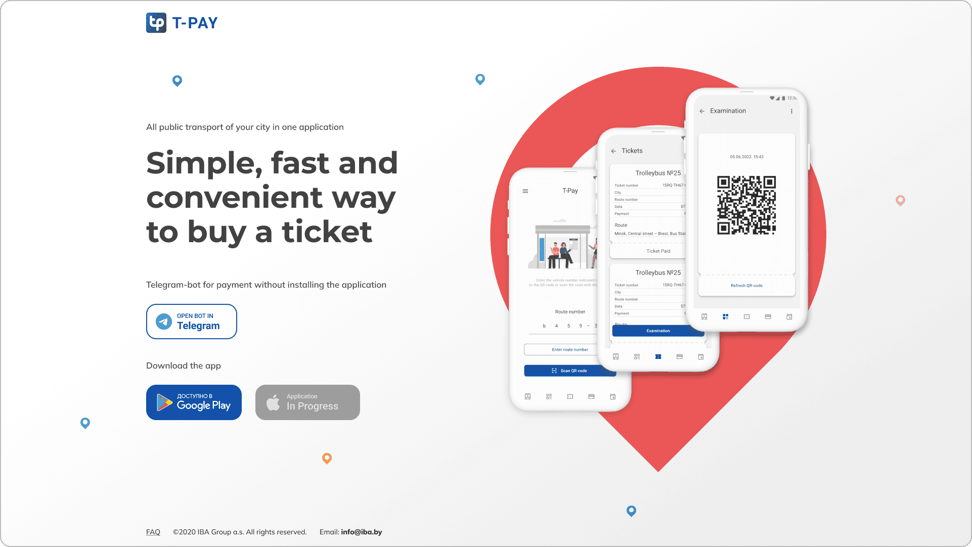
The landing page provides easy access to the app on Google Play and Telegram bot.
Results & Learnings
As a UX/UI designer, this project allowed me to work on a large-scale system and strengthen my design skills. I designed two applications, creating detailed prototypes, user flows, UI components, animations, logotypes, and promotional materials, including flyers, vehicle stickers, video instructions, plastic cards, and Telegram stickers. I also developed desktop and mobile versions of the landing page and UI design for the transport company control system.
This experience emphasized the importance of attention to detail, research, testing, and iteration. I learned how crucial user feedback is in shaping a product that truly meets user needs. The project helped me grow as both a designer and problem solver.